
Beauty shoppers cannot pick up a bottle, test a lipstick, or inspect a pump when they browse online. That makes every image part of the buying experience. A thoughtful approach to beauty product photography gives customers a clearer view of what they are considering while giving marketing teams assets they can reuse across launches.
The goal is not to make every photo identical. It is to build a visual system that keeps essential product information consistent, then leaves room for campaign creativity, lifestyle scenes, and seasonal storytelling.
1. Why Consistency Matters In Beauty E-Commerce
When a collection uses mismatched backgrounds, uneven crops, conflicting shadow directions, or noticeably different color treatments, comparison becomes harder. A consistent presentation helps shoppers focus on the differences that matter, such as formula, size, shade, or benefit.
For example, a skincare line may use the same front-facing angle, background tone, product scale, and light direction for every serum and moisturizer. That structure makes a collection page easier to scan while still allowing more expressive images elsewhere in the customer journey.
2. What A Complete Photo Library Should Include
A single hero image cannot answer every customer question. Each asset should have a defined job, particularly when packaging carries important information. Teams should preserve clear label views and use the cosmetics labeling requirements as a useful reminder that packaging details deserve careful review.
• Primary listing image: A distraction-free view that identifies the product immediately.
• Front, back, and side views: Images that show directions, ingredients, size information, closures, and package shape.
• Detail shots: Close-ups of labels, pumps, droppers, applicators, caps, or embossed finishes.
• Texture and swatch images: Useful for creams, liquids, powders, and color cosmetics.
• Scale and lifestyle images: Context for size, routine, and use without obscuring the item.
• Motion assets: Short clips for product pages, social placements, and advertising.
3. How To Set A Visual System
Document the visual rules before the first product is photographed. Choose an approved background palette, a standard primary angle, product placement boundaries, crop ratios, shadow softness, and a preferred amount of negative space. These choices create a recognizable family resemblance across the range.

Separate Core Rules From Creative Rules
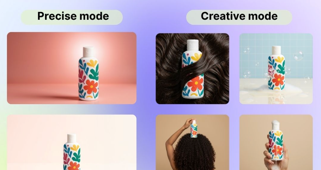
Core listing views should stay simple and stable. Lifestyle and campaign images can use props, bolder colors, unusual compositions, and richer environments, provided the product remains recognizable, and packaging details are not altered.
4. How To Build A Repeatable Shot List
A shared shot list keeps photographers, editors, designers, and marketers aligned. Use a spreadsheet or project board that records the product name, variant, required image types, approved background, label views, detail shots, target dimensions, file name, reviewer, and approval status.
Start with a baseline set for every stock-keeping unit, then add product-specific needs. A lipstick may need a bullet close-up and arm swatch, while a cleanser may need a pump, foam, and back-label images.
5. How To Photograph Different Beauty Materials
Packaging materials respond to light differently, so one setup rarely flatters every item without adjustment. Glass can create distracting reflections. Glossy plastic needs controlled highlights. Matte tubes need enough side light to show their form. Metallic caps often require deliberate reflection shaping to look clean rather than chaotic.
For creams, serums, and powders, show texture honestly. Retouch dust, spills, or distracting marks when needed, but avoid edits that make a product appear to have a different color, thickness, or finish.
6. How To Protect Color And Product Accuracy
Color control is especially important for foundation, concealer, lipstick, blush, nail color, and hair color. Capture under controlled lighting, keep export settings consistent, and compare final files with physical samples whenever possible. The principles of color management are useful here because screens and output formats can render the same image differently.
Review shade assets at full size and thumbnail size, and check them on more than one display when practical. Generated or heavily edited images should also be compared against the physical product to catch incorrect text, distorted geometry, or inaccurate shades.
7. How To Prepare Images For Different Channels
One master image is rarely ideal everywhere. Product pages need a predictable image sequence and readable details. Marketplaces may have specific background or text rules. Social media benefits from vertical crops, movement, and stronger visual emotion. Email images need to stay clear on small mobile screens, while retail presentations should make ranges easy to compare.
8. A Simple Quality-Control Checklist
• Confirm the package shape, cap, pump, hinge, and applicator are correct.
• Check label legibility and verify that the correct variant appears in the file.
• Compare the visible shade and packaging color with the physical item.
• Review reflections, dust, edge quality, sharpness, crop, and background consistency.
• Check how the image reads as both a thumbnail and a full-size asset.
• Confirm that the export meets the destination channel’s requirements.
9. How To Organize The Production Workflow
Use a clear sequence: plan the shot list, prepare clean samples and reference items, capture according to the visual system, edit without changing product identity, review for accuracy, export channel-ready files, and archive approved originals with production notes. Organized folders and descriptive file names make future refreshes and new launches faster to manage.
10. Common Mistakes To Avoid
• Prioritizing campaign imagery before securing essential listing views.
• Using an inconsistent product scale across a collection.
• Letting props cover labels, product names, or key package features.
• Applying filters that change a shade or packaging color.
• Skipping back and side views where customers need more information.
• Approving images only at full size and never checking smaller placements.
Conclusion
A consistent beauty product photo library is built through repeatable decisions. Clear angles, controlled lighting, accurate color, readable packaging, and disciplined review standards help each image do its job. Once the core system is in place, creative teams can produce more expressive campaign work without sacrificing the clarity shoppers need to make confident choices.
