
A printed guide gives people something dependable to hold, mark up, carry, and revisit when they need an answer quickly. Whether you are preparing materials for volunteers, customers, students, event guests, or community members, the goal is not simply to make the pages look polished. It is to help readers complete a task with less confusion. Well-planned custom booklets made to order can turn instructions, reference material, and checklists into a practical resource people will actually use.
The strongest guides anticipate the reader’s questions before they arise. They put the most important information first, explain it in plain language, and make the next step easy to spot. A useful guide does not need flashy design or lengthy copy. It needs a clear purpose, an organized structure, and a final review that checks both usability and print quality.
1. Start With a Clear Purpose
A printed guide can support onboarding, training, product setup, event participation, education, and public services. Before writing a single section, create a one-sentence purpose statement. For example: “This guide helps new volunteers prepare for their first event.” That sentence becomes a filter for every page. If a detail does not help the volunteer prepare, it may belong in a separate resource.
Trying to serve several goals at once makes guides harder to follow. A booklet that explains company history, teaches a process, promotes services, and answers technical questions can leave readers unsure where to begin. Choose the primary action your reader should take, thenbuild the content around it.
2. Build the Guide Around the Reader
Think about who will use the guide, where they will use it, and what they need to do immediately afterward. A first-time visitor at a busy event needs different information than an experienced employee completing a specialized task. List likely reader questions before drafting, such as “Where do I check in?” “What should I bring?” or “Who can help if something goes wrong?”
Separate essential instructions from useful background. Put must-know details near the front, and move context, history, or deeper explanations to later pages. Also consider reading level, language needs, vision, mobility, and whether readers can rely on a phone or internet connection. Designing for the real reader creates a guide that feels welcoming rather than demanding.

3. Plan a Simple Page Structure
A predictable structure helps readers find information without reading every word. A practical flow often includes a cover, a quick-start page, main instruction sections, a checklist, contact details, and final notes. Use clear headings to separate topics, numbered steps for actions that must happen in order, and bullet points for related facts.
Use this planning checklist
• State the guide’s main purpose in one sentence.
• List the reader’s first three questions.
• Place urgent actions and deadlines near the beginning.
• Keep related details together on the same spread when possible.
• Add contact information where readers are most likely to need help.
4. Write in Plain, Direct Language
Write as though you are calmly helping one person complete the task. Prefer active verbs and short sentences: “Bring your ID to the registration desk” is clearer than “Identification should be presented during the registration process.” Give one instruction per sentence when order matters, and explain unavoidable technical terms the first time they appear.
Examples make vague advice practical. Instead of saying “submit materials promptly,” say “email the completed form by 5 p.m. on Friday.” During the final edit, remove repeated ideas, filler phrases, and wording that could be interpreted in more than one way. Readers should not have to guess what action is expected.
5. Use Visuals That Support the Message
Photos, diagrams, maps, icons, charts, and callout boxes should make information easier to understand, not simply fill empty space. Use a labeled photo to show where a button is located, a map to direct visitors, or a diagram to explain an assembly step. Arrows and short labels can guide attention to the exact detail that matters.
Consistency is especially important. Reuse the same icon style, color bands, label placement, and heading treatment throughout the booklet. Research on image use in field guides also highlights the value of standardized, clearly labeled visuals that readers can compare quickly. Avoid tiny images, distracting backgrounds, and decorative graphics that compete with instructions.
6. Make the Guide Easier to Read
Readable design starts with adequate font size, comfortable line spacing, short paragraphs, and generous margins. Use strong contrast between text and its background, such as dark text on a light page. Do not rely on color alone to communicate meaning. Pair colors with labels, symbols, or patterns so readers can still understand the page when color is difficult to distinguish.
Large blocks of text can discourage readers, especially when they are rushed or unfamiliar with the topic. Break long explanations into headings, bullets, examples, and callouts. If the guide will serve a broad audience, provide a searchable digital version alongside the print edition.
7. Test the Guide Before Printing
Give the draft to people who resemble the intended audience and ask them to complete real tasks. Do not only ask whether they like the design. Watch where they pause, skip a step, ask for clarification, or lose their place. Those moments reveal the pages that need revision.
Ask focused questions: What would you do first? Where would you look for this answer? Which instruction feels unclear? What information seems unnecessary? Guidance on creating a useful user guide reinforces why task-based feedback is more valuable than general opinions. Revise the guide based on patterns, not one isolated comment.
8. Prepare the Final Files
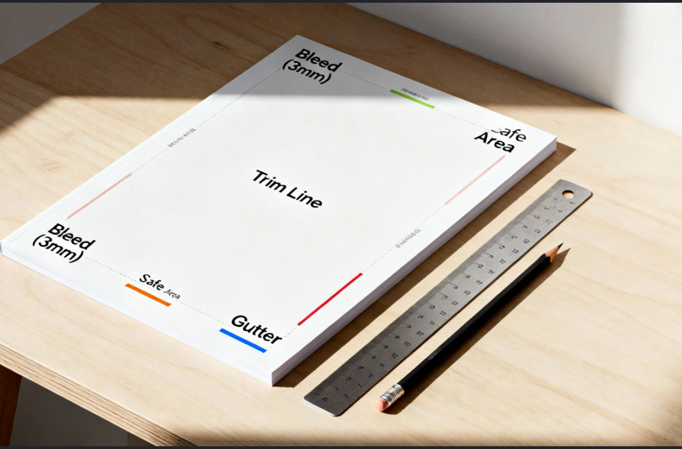
Before production, check page order, page numbers, captions, names, phone numbers, web addresses, dates, and spelling. Confirm that images remain sharp at the final size and that essential text stays clear of trim, fold, and binding areas. Use a consistent color process throughout the document, then export a print-ready file and inspect every page at full size.
Request a physical proof when color accuracy, small text, or image detail matters. A proof can reveal issues that are easy to miss on screen, including thin type, awkward folds, weak contrast, and unexpected color shifts.
9. Avoid Common Guide Design Mistakes
• Writing for everyone instead of one defined audience.
• Leading with organizational history instead of the immediate reader’s needs.
• Using decorative fonts, crowded pages, or too many competing callouts.
• Providing instructions without a clear next step.
• Skipping user testing and relying only on internal feedback.
• Updating the cover but overlooking outdated details inside the guide.
Bring the Pieces Together
A useful printed guide reduces effort and helps people act with confidence. Define its purpose, understand the reader, organize the information, write clearly, use visuals with intention, test the draft, and inspect the final files carefully. Before sending your next guide to production, read it from the user’s point of view and ask one simple question: Can this person find the next step without needing to ask for help?
